Monday, 22 March 2021

Superman / Fantastic Four


I never thought I would see the day when I would read the title "Superman/Fantastic Four".


I never thought I would see the day DC & Marvel would release another tabloid size comic book.


I never thought I would see the day I would purchase a DC/Marvel & Tabloid book and think...well you will have to read.


Rather than explain the story here is a great link with the description from CBR: 

www.cbr.com/superman-man-steel-herald-galactus/

Pencils Dan Jurgens & Art Thibert

Inked by Art Thibert

Colours Gregory Wright

Letterers Bill Oakley

Cover by Dan Jurgens & Alex Ross


The concept of Superman / Fantastic Four sounds exciting. First question is WHERE IS JOHN BYRNE?


Well Byrne knows where he is, or was at the time, with both companies. Byrne defined both Fantastic Four and Superman in the 80s, so this was a no brainer, however politics be damned, it wasn’t going to happen.


The crossover itself is mediocre at best and as far as visuals go Jurgens isn’t to my liking in comparison to let’s see, Batman vs Hulk which is a visual masterpiece.


Before everyone defends Jurgens please remember art is relative. I don’t settle when it comes to an epic idea like this. Some fans do settle or have a different palette. Good for them. You want the best out of any creative medium then you need to be able to take constructive criticism. In this case with comics so that we get the best out of characters and creators.

If I like a band and they have 20 albums but not every album is good, then I will critique. Blind love is not a way to go through life.

My friends and I are always a little irked by defensive fans who love blindly. You can be passionate about something but also realistically objective.

Dan Jurgens is a great idea man. Honesty I do like him. I liked him in the 80s. He hasn’t really evolved since the 80s. His art is basically the same angles, hand movements, layout etc. He kind reminds me of how I used to draw in high school: loose, carefree, a bit of a bronze age influence artistically but not the guy you would go to for an epic visual tale. So I like him, for certain aspects and time in comics.

Art Thibert is a great inker, I’m thinking Kevin Nowlan probably could have done some justice to the inks the way he did on Superman vs Aliens which is a visually brilliant!


The story as it stands is good. Not great, but really good. However a comic book is 50% writing and 50% art. If one of the 2 is off, you don't have the full potential of what it can be.

I give the book a C+ if not for anything the idea and format. Execution and art? I’ve said what needs to be said, my perspetive.

It’s only comic books folks, enjoy!!!


Tuesday, 26 January 2021

The Amazing Spider-Man: the Gauntlet

It is well documented with longtime Spider-Man fans that, without question, the Amazing Spider-Man #229 & #230 are among the best stories from that book in the 1980s.

I loved that period for reasons as follows: for one I was a kid and in the Marvel Universe Spidey was king, to me. Secondly I also thought John Romita Jr's take on the character was definitive. With that, Roger Stern gave a hell of a run. As a writer/artist team they were a force on that book, right up there with Lee/Ditko, in my opinion.


However when I was a kid I missed both these issues!

Fast forward decades later and the price for me to pick up the books was beyond what I was willing to pay. I also missed the Spider-Man Megazine from the 1990s that reprinted these 2 stories as well. Any trades or hard covers was either off my radar or too pricey when I got to it.

Which brings us to 2010s the Amazing Spider-Man: the Gauntlet trade paperback.


This is sweet. Why? I’m getting the two missing issues of Amazing Spider-Man #229 & #230, but for other reasons to follow............

What lead me to purchase the books was the back up story of ASM #229 & #230, what became the icing on the cake were the “new stories” that were the actual stars of the book.

In ASM #626 we have artist Michael Gaydos beautiful art (and when I say I art he also coloured the story as well). He’s quite a talent. He has that ‘drawing from photo’ look a la Alex Maleev but also has that groovy shadowy semi hyper realistic style of John Paul Leon with a little wink and nod to the story board style of Rodolfo Damaggio. For those story driven the writing by Fred Van Lente delivered the goods, nothing ground breaking but a good old traditional feel to the Spidey legacy storytelling.

I should also mention the colours used, the tones, has a 70s New York crime movie feel but also bright and earthy /meets the 1960s groovy classic Spider-Man cartoon (dig them skies!).


It only gets better from here as Roger Stern is back along with Lee Weeks continuing the momentum in ASP#627 to #629. There is lots going on here, it has the classic Stern feel of his 80s Spidey work along with the amazing art of Lee Weeks.


Both Weeks and Gaydos give us the pre-1990s/McFarlane Spidey eyes, the kind Romita Jr and his predessors drew. I love it. That’s my Spidey. I won’t talk about the story, for the story you would need to read it!


Another story has also found it’s way here by Mark Waid and Tom Peyer, decent enough as it goes and worth the read. 

So why am I writing this review? I’m no critic. I do not wish to critique. What I want to do is praise!

Kudos the talented teams on this book all of whom I applaud and all of which I wouldn’t own a copy if not for the fact that "when I was a kid I missed Amazing Spider-Man #229 & #230".

Nuff Said!


#JohnRomitaJr #RogerStern #MichaelGaydos #LeeWeeks #spidermanartists

Monday, 23 November 2020

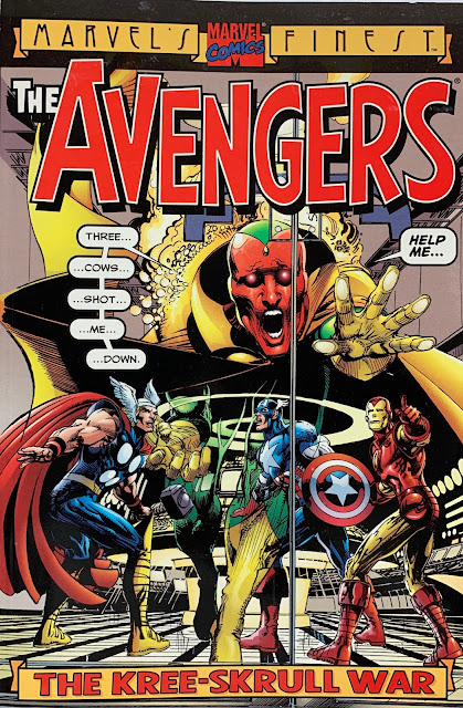
The Avengers Kree-Skrull War Trade Paperback


Do you ever buy a book, maybe a graphic novel, hard cover/trade paperback and question the graphic design vs printing results?


For example this trade paperback of Avengers Kree-Skrull War (published in 2000) has an obvious concern regarding this. If you have a copy take a look at the first inside page the bottom publisher details text. 

It’s not legible.


Barely legible, don't you think?


Who do you blame? The designer? The editor? The printer? If one doesn’t flag the concern from one professional to the next the results are proof, in this case both a design and printers error. Makes one wonder who dropped the ball?

It's just human error. At the end of the day it's meaningless. Depending on who you are this may or may not mean anything to you, but if you have a graphic design eye this may be one of those situations that make you go......hmmmmm.

Hmmm?


Friday, 21 October 2016

SUPERMAN the Many Faces of the Man of Steel

(last edit November 2020)

Superman the Man of Steel first superhero. Popular since since debut in 1938 and in different mediums from his origins in comics to cartoons, tv shows, movies, video games and so on.

His look plays a crucial part in his popularity especially his iconic costume (imagine if Superman were wearing a  purple plaid jacket,  grey corduroy pants and  brown sandals? No, not at all, indeed). Visuals to any famous icon play a huge role in popularity.  Even more so is the artists rendition of such an icon. 

With this in mind (and just for fun) here is a list, a reflection if you will, of some of my favourite interpretations of Superman as he has been presented to us over the decades.

Joe Shuster
The father, the co-creator (along with Jerry Siegel) and artist on Superman who brought this character to life is and always will be the template for others to follow. His Superman was simple, confident, alpha and an all around "super-man"! His art worked for what it was in the time it was done. It's still a timeless classic, always respected!


Max Fleischer Studios
The Max Fleischer Studios and (the man himself for which the studio was named) was known as Disneys number one competition. In fact this was true his animation was in fact a stunning moving visual. All his the animation they did and not just for Superman was ground breaking and original. Ahead of it's time, quite beautiful and competitive with anything out there even today! I urge animation enthusiasts as well as comic book readers, if they haven't, to watch or again re-watch this classic series of serials made for the cinema. Arguable still when of his finest animation moments and still inspiring animators and other visual artists to this very day.


Wayne Boring
Wayne has a zesty clean animated, simple and elegant style. His was a natural choice in the artistic evolution coming from Shuster.


Curt Swan
The "Godfather" of Superman artists. Check out Curt Swan. No really stop reading this and check him out. Do a search. The man drew Superman for decades! His is THE fan fave with the majority of seasoned fans. His body of work on Superman was everlasting. His style? His style was semi realistic, elegant, classy and tastefully done. He came in as the golden age of comics was dying adn the silver age was sprouting. He endured through the bronze age and what some call the modern age of comics. There is no one like Curt Swan in comics. He's one of those true irreplaceable artists in the comic book world.


FILMATION STUDIOS
In the mid-to late 60s super hero comics were a buzz once more. Marvel was DC's competition. DC had huge popularity with Superman in the comics and on the old George Reeves series. Adam West's Batman burst on to TV screens in 1966. Filmation Studios put out some DC animated stuff. Superman, Superboy, Batman, Justice League and even the Teen Titans appeared on the Filmation watch. The renditon of Superman had a Curt Swan inspired look about him (as did Batman by Filmation modelled after Carmine Infantino/ Murphy Anderson art/Adam West TV show model to it).


SWANDERSON (Curt Swan and Murphy Anderson)
Some people love this team, some people don't. I like Curt Swans rendition of Superman. I like Andersons ink techniques and art. The two together were a great team. Anderson really brought the best in Swans elegant action soap opera action with his beautiful brushed inking techniques. The two deserve to have their entire run together reprinted in an Omnibus or affordable trade paperback series of some kind. To me it was that good.


Neal Adams
The man who changed everything. Know it or not on so many levels Neal Adams changed comics, art, storytelling and....well I could go on but don't need to as his story is well documented. 
His most noted work at DC comics was Batman, Green Lantern, Green Arrow and Deadman.
However he did do Superman just never on a regular monthly comic book. His most memorable will be Superman vs Muhammad Ali.


José Luis García-López

José Luis García-López one of the best Superman artists. Ever. Period. I am a die hard Neal Adams fan but it doesn't take away from the fact that no matter how great Neal Adams was on ANY character, García-López truly made Superman definitive, iconic to me.  He is a great storyteller who really captured the essence of a modern day Man of Steel when he started rendering Superman in the the 70s. He didn't draw Superman often, or often enough for me, but impact has nothing to do with time or length on a book. It has to do with reaction and influence. His DC shutterstock guides, that he started doing at the start of the 1980s (used for artist drawing DC characters as well as for use in product licensing), has been used for decades!  His rendition bearing  strange and awesome resemblance to Christopher Reeve was in fact, all but fate, as he drew the character before Reeve was ever Superman!

Taken from an online article: 

Q: JLGL rendition of Superman looking like Christopher Reeve. JLGL:.. Coincidence, because I never had that intention. Nobody told me to copy or re-create Christopher Reeve.…He was perfect. Not only his body and face with its perfect features, but also his personality was like Superman. He exudes happiness and, let’s say, all the attributes that Superman USED TO have.… So, I feel flattered that people compare him with my Superman but it was never intentional.

 
 His Superman to me was a visual masterpiece, elegant, alpha, strong, passive, controlled, graceful and kick-ass.


#JoséLuisGarcía-López 


Gil Kane
A classic artist on many books for decades before Superman. He came along in the early 1980s for short and memorable stint. His Superman was sleek, elegant, dynamic and modern looking. He almost had that Christopher Reeve look to his art with that slender muscular figure. His style loose and fast paced worked well on the Superman books.


John Byrne
The Superman we all knew and loved up 'til 1985-86 would be gone. DC did a major reboot on it's whole line and Superman fell prey to the changes. 
Luckily Supermans reboot was in the hands of John Byrne who was fan fave during his short run in the late 80s on the Superman books. His was John Byrnes Superman of course, also noted by some to remind them of the one and only Chistopher Reeve Superman and a wink and nod to George Reeves Clark Kent. (My tongue in cheek critique and off topic to this post would that Byrne always had Superman with a torn cape after some incident occurred. Naturally that is logical since in this version of the characters his costume wasn't on board a the rocket from Krypton that landed on earth with him as a baby. No, it was, in fact, made from just regular earth materials for Superman to wear. My critique is thus, if Supermans cape is going to tear in almost every issue that Byrne (and beyond) drew then what would be the point of the cape? None. Pre-Crisis or Post Infinite Crisis and reboots to follow had his costume come from Krypton and somewhat modelled after Kryptonian attire. More logical, aye Byrne?)
#JohnByrneSuperman


Bruce Timm
We did see a macho tanned Superman in the 70s and early 80s on the Superfriends. A minor facelift was given for Super Powers but this Superfriends Superman was not that impressionable, to me. But I did like that version. Although we got a semi cool looking Superman in the late 80s Ruby Spears cartoon, reminiscent of Gil Kane who provided style art along with a bit of Chris Reeve and art JL Garcia Lopez could be seen. HOWEVER..... Bruce Timms version is memorable for his work at Warner Animation studios on the Superman cartoon and Justice League cartoon.


Alex Ross
Alex Ross is a painter with such super realistic visuals like photos come to life. He tries to capture the essence of each character he paints. If it's Batman he will get inspiration from Bob Kanes 1939 Batman as much as Neal Adams 1970s Batman. The same holds true for Alex who grew up almost the exact same age as me I think we are a year apart. So we know Chris Reeve or Shuster or Swan or George Reeves and he takes the best from these and more to give us a definitive Alex Ross Superman.
#AlexRossSuperman


Gary Frank
Garys run on Superman is most memorable not just because he is a great artist. But because no other artist has intentionally use actor Christopher Reeves Superman as his artist version in the comics. The results? Along with writers Geoff Johns and Richard Donner (yes that Donner as in Director of Superman the Movie and part of Superman 2 - Donner!) gave some wonderful pieces of work!


*********************************************
When DC did a another reboot at the end of 2011 they totally changed Superman for the first real time in 7 decades. I cannot acknowledge this version sad to say and I am sure there are some amazing artists who have worked on him since.
*********************************************** 
#Superman

 And well that's that for now! I may edit the written content as I have not re-read or edited this, as it's just for fun! Enjoy!

(Minor Edit/update as of November 2020.)